top of page
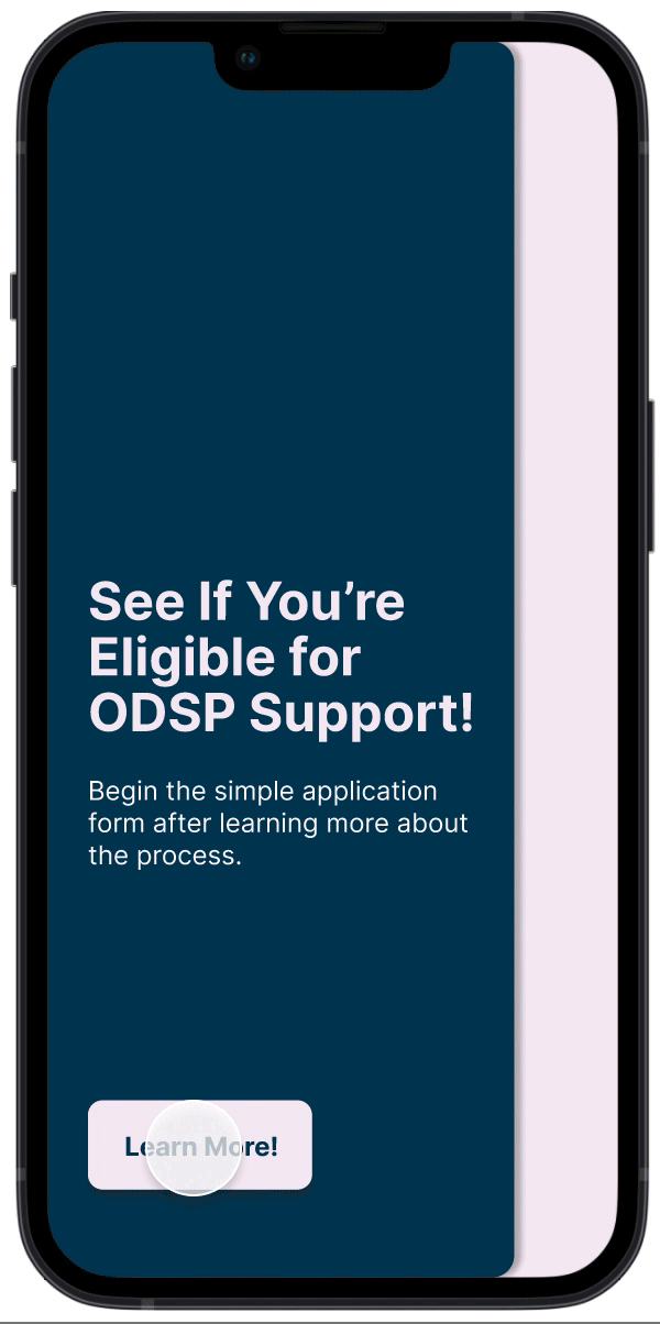
ODSP Application
Empowering applicants by simplifying questions, and providing transparency throughout the process.
* Ontario Disability Support Program (ODSP)
_iphone13midnight_portrait.png)


Project Specifics
-
UX Designer
-
Sept 2018 - Apr 2019
-
Government Services
THE PROBLEM
Ontario disability support applicants have a stressful time completing the application
People who are in need of disability support should not be intimidated by the application process. Currently, the online form consists of redundant and unnecessary questions, making the process tedious and frustrating. The goal is to create an efficient application that only includes the most essential questions. We also want to provide transparency throughout the application process so users always know what their next steps are going to be.
THE SOLUTION
Make applicants feel prepared before starting
1
Simple, and comprehensive onboarding
Make applicants feel at ease before starting which gives them more motivation to finish
Provide clarity on documentation needed for the process
Modern design which is pleasing on the eye, compared to reading long forms
2
Empower them through simplistic application questions
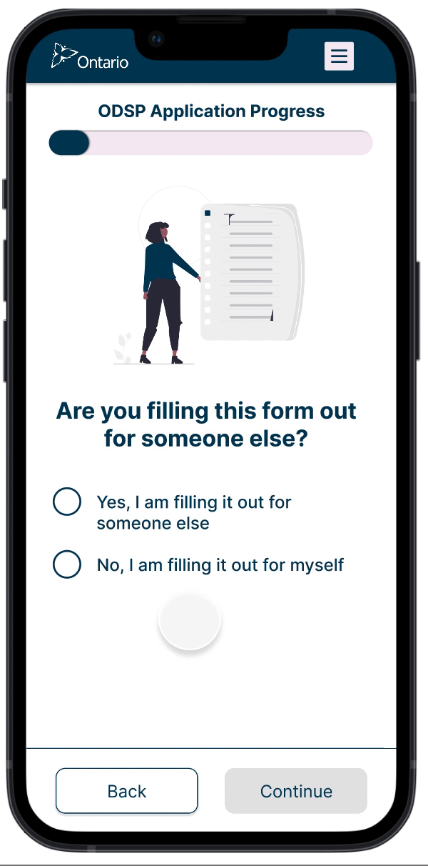
Simplified application questions
Single question per page
Progress bar to indicate where they are in the application
Relevant input fields that corresponds accordingly to the question type
Easy access to CTA's
Utilization of microcopy for ambiguous terminology
3
Inform applicants of what happens after completing the application
Accessible, and compact offboarding
Provide an estimate of how much financial support applicants are eligible to receive
Clearly listed next steps after completing the application

OUR DESIGN APPROACH
What I championed in the design process
1
Define
Understanding problem space
Defining project goals
Expected methods
Schedule forming
2
Research
Case worker inquiries
User interviews
Task analysis
Persona creation
Journey mapping
Affinity mapping
3
Design
Crazy 8's design ideation
Sketching
Wireframing
Wireframe usability testing
Design iteration
3 rounds of usability testing
Final prototyping
4
Evaluate
Case worker evaluation
Usability testing
Guerilla testing
WHITE PAPER RESEARCH
Applicants desire transparency and simplicity
1)
Users do not want to wait three months to know if they are eligible or not
2)
Documents needed for the application are not stated at the beginning of the process
3)
The entire application needs to be completed in a single sitting, users can't save their progress
4)
There are too many unnecessary form fields
5)
Help text does not clarify questions, or explain why certain information is required to be provided
Framing the problem
In order to create a solution that effectively solves all the user's pain points, my team and I spent time getting familiar with the problem.
1)
Understand, and familiarize ourselves with the existing process
2)
Organize a meeting with the client and key stakeholders to ask questions and clarify knowledge gaps.
3)
Define the user and their goal to create task flows, including all possible edge cases
4)
List success metrics, and business constraints
CASE WORKER INTERVIEWS
Case workers revealed problems aside from the current inefficient application questions
ODSP caseworkers' job is to try and arrange disability support for Ontarians in need of it. They directly deal with ODSP applicants, which is why learning what they already knew was a high priority task for our team.
1)
Many applicants require ODSP only for the drug benefits, not the financial support
2)
Applicants must wait 90 days to find out how much money they can get (given that they are eligible)
3)
A lot of applicants have only have a very basic knowledge of English
Applying the learnings
1)
Redirect uses to the most appropriate government program based on what they need support for
2)
Create a proof of concept confirmation page that shows how much financial support they can receive
3)
Include distinguishable iconography, make form fields intuitive and easy to fill out
PERSONA CREATION
Meet Amira! A typical ODSP applicant

Amira • 37 years old • new immigrant to Canada
User Story
Amira just arrived to Canada as a single mother of 3 children under the age of 12 years old. Before leaving her native Pakistan, she registered as having a disability. Upon arriving in Canada she was set up to apply for disability support but quickly found that the application process was very difficult.
Goals
-
Easily apply for ODSP
-
Receive financial assistance quickly to support her children
-
Learn about her financial eligibility, and understand what next steps after completing the application are
Pain Points
-
The application is long and tedious
-
Some application questions are unnecessary, and does not explain why they are asking for sensitive information
-
She is left in suspense for months wondering what her eligibility is, there was no application feedback after completion
Characteristics
-
Single parent to young children
-
Few assets
-
Renting for housing, and earns a very low income (<20k per year)
DESIGN IDEATION
Wireframing design concepts allowed me to test potential solution directions

Minimalist-centered design application process
Strengths
-
Single question per page
-
Simple question verbiage
-
Easily accessible CTA
-
Progress bar to indicate how far you are from completion
Weaknesses
-
Increased number of question pages
-
Navigation to previously completed questions takes a little longer
Transparent onboarding and offboarding
Strengths
-
Applicants are more prepared to successfully complete the application in a single sitting
-
More motivation to complete with the extra sense of empowerment
-
No feelings of anxiety about what to do after completion
Weaknesses
-
Easy to skip through if an applicant does not realize the purpose of onboarding and offboarding
-
Applicants still have to wait on the ministry for application approval/rejection


WIREFRAME TESTING
A sense of relief was the common feeling among applicants for the new design
Continuous testing is a practise that I was not initially familiar with. It showed me that if mistakes are found early in the prototyping process, then the team can pivot, saving the company time and money.
Scenario: Mary has sustained an injury at work that is causing her to lose vision in both her eyes. The doctor informs her that within a few months she will have a hard time seeing things clearly. She is in need of financial support so she goes online to apply for ODSP support.
Findings
-
Wording on some questions was ambiguous
-
Users finding out if they are medically eligible upon submission of the application was a pleasant surprise
-
Users like knowing how far along in the process they are
-
Being able to navigate through previous answers was desirable
FINAL PRODUCT
High fidelity screens


_iphone13midnight_portrait.png)
CONCLUSIONS + LESSONS LEARNED
What I'd do differently next time
1)
Remove, remove, remove! By eliminating unnecessary features and components that were not useful to users I was able to learn the importance of simplistic design. Through multiple stages of usability testing, I was able to create a minimalist design that did not reach the point of abstraction. I understood that the design was complete when users could complete the desired tasks while no remaining components could be removed from the screens.
2)
Be big-picture driven. Often times I found myself becoming too focused with minute details in the design. I would also find myself spending too much time on shiny features that ultimately would not create much value for users. In order to combat that, my mentor suggested that before investing time in a feature, or new design approach, convince yourself of why the extra work would be beneficial to users.
3)
Iterate as much as possible. No matter how complete I felt my designs were, there were always issues that I didn't see that users revealed to me during testing. I learned that when I spend so much time on a given design I start to develop tunnel vision and miss certain inefficiencies and deviations from the norm of mobile form design. So it is of paramount importance to constantly ask for feedback from many different sources before confirming that a design or design approach has been validated.
_macbookgrey_front.png)

bottom of page